Forms and actions
Every change a user makes should feel the same, whichever module owns the record. Writes follow one path: a button opens a form, the form resolves with the saved record, and one composable per entity owns the toasts and the refresh. This page covers that path: create and edit forms, row menus, confirmations for destructive actions and feedback.
The screens that show the results are on Pages.
Create and edit
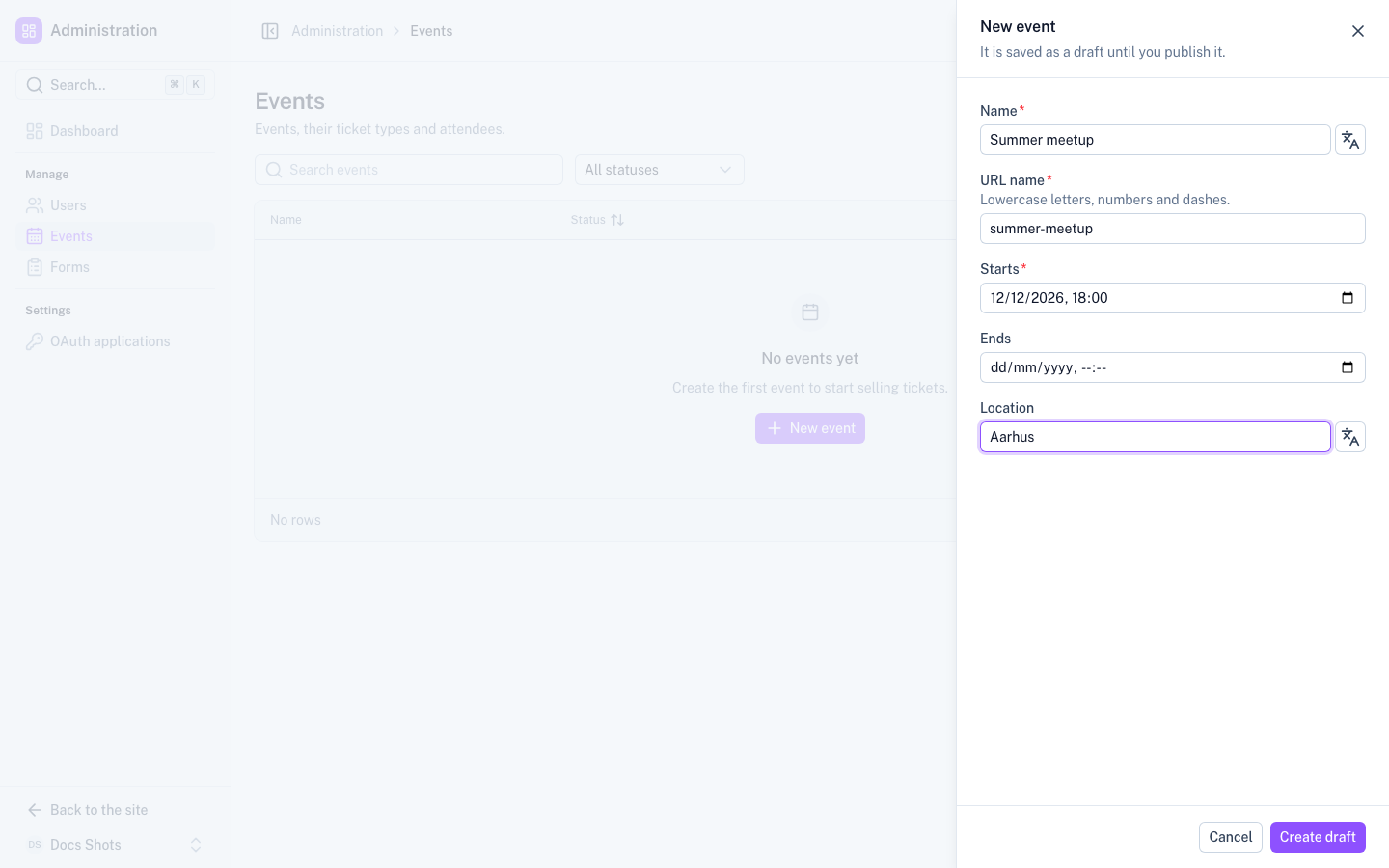
- Slideover. Create and edit forms open in a slideover (
FormSlideover) that holds aUFormwith a zod schema. - Modal. A short yes or no choice is a modal (
UModal). - Never inline. Never put a create form next to a table.
- Open through an overlay. Open forms with
useOverlay(). The overlay resolves with the saved record, orfalsewhen cancelled, so the caller can navigate to it. - Buttons. Cancel is a neutral outline button (
color="neutral" variant="outline"). The primary action comes last. The slideover component sets up both for you. - Hints. A hint goes in
UFormField'sdescription, not in an extra paragraph. - Layout. Slideover forms stay vertical, with plain
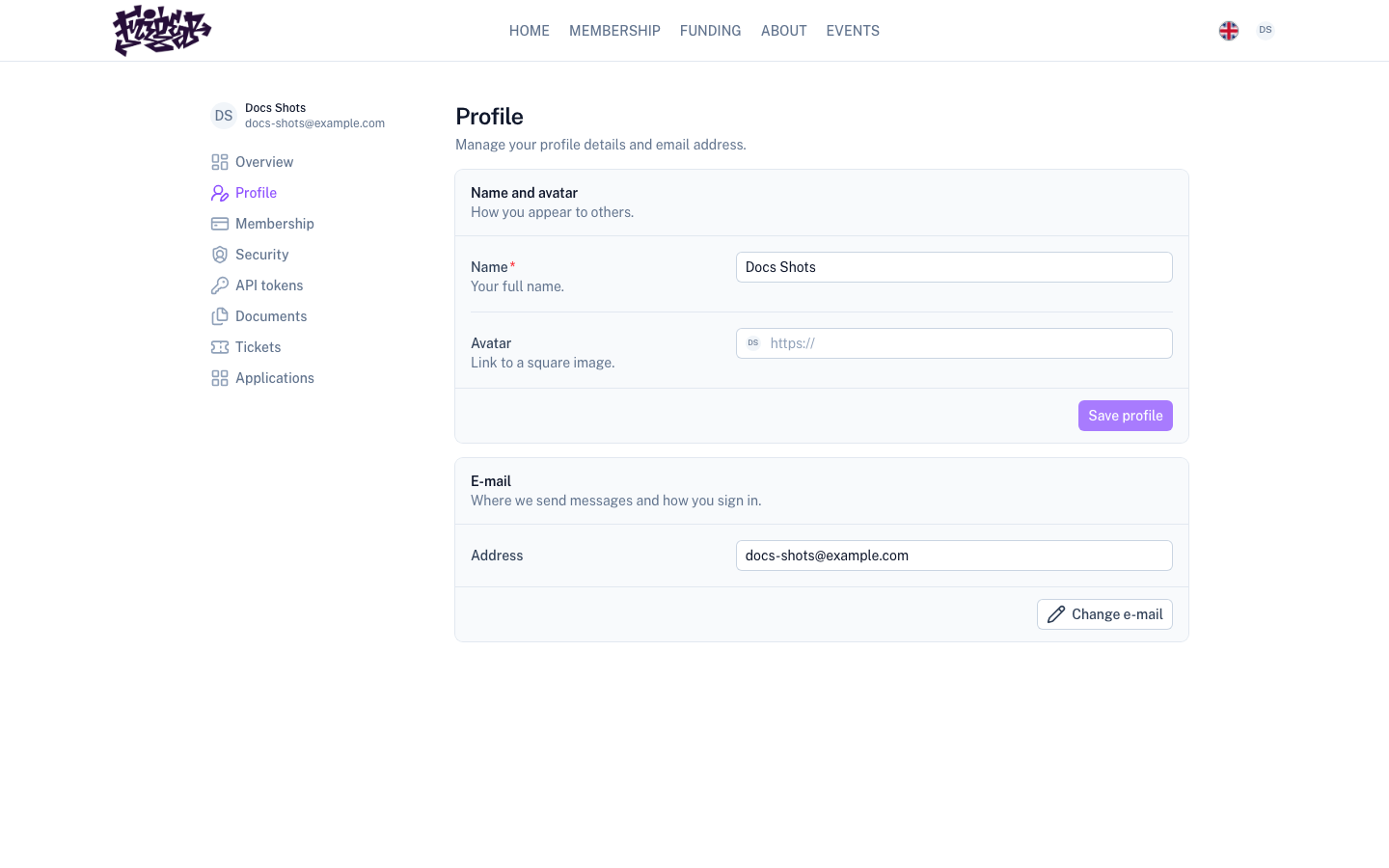
UFormFields. Inline settings forms in aSectionCarduse horizontalFormRowrows. See Detail pages.
A create form opens in a slideover over the list, with Cancel and the primary action at the bottom:
An inline settings form puts label and control rows in a section card, with Save in the card's footer:
<!-- EventFormSlideover.vue -->
<script setup lang="ts">
const props = defineProps<{ event?: EventRow }>()
const emit = defineEmits<{ close: [saved: EventRow | false] }>()

const t = useModuleT('events')
const { busy, run } = useAction()
const state = reactive({ title: props.event?.title ?? '' })

const save = () => run(async () => {
  const saved = await $fetch<EventRow>(props.event ? `/api/admin/events/${props.event.id}` : '/api/admin/events', {
    method: props.event ? 'PATCH' : 'POST',
    body: state,
  })
  emit('close', saved)
}, { success: t('admin.saved', 'Event saved') })
</script>

<template>
  <FormSlideover
    form-id="event-form"
    :title="event ? t('admin.edit', 'Edit event') : t('admin.create', 'New event')"
    :submit-label="event ? t('admin.save', 'Save event') : t('admin.create', 'New event')"
    :loading="busy"
    @close="emit('close', false)"
  >
    <UForm id="event-form" :state="state" class="flex flex-col gap-4" @submit="save">
      <UFormField name="title" :label="t('admin.title', 'Title')" :description="t('admin.titleHint', 'Shown on the public page.')">
        <UInput v-model="state.title" />
      </UFormField>
    </UForm>
  </FormSlideover>
</template>
Create button
The primary create button has icon="i-lucide-plus". Its label names the object, such as "New event" or "Add user".
The page only calls actions.create(). The actions composable does the rest:
- It opens the
FormSlideover. - It navigates to the detail page, when the entity has one.
- It returns the record, or
falsewhen cancelled.
The page never navigates itself.
One actions composable per entity
Every entity has one actions composable, named use<Entity>Actions(), such as useUserActions, useEventActions
or useFormActions. It keeps pages thin and every page consistent:
- It owns create, edit and remove, the toasts and the refresh afterwards.
- It returns
menu(record)for the row menu. So every list and detail page offers the same actions in the same order. - It lives in the module that owns the entity, not in UI.
Sub-entities that have no page of their own, such as an event's ticket types and add-ons, get a composable of their
own too. Its menus skip Open. useEventCatalogActions is the example.
// composables/useEventActions.ts
export function useEventActions() {
  const t = useModuleT('events')
  const overlay = useOverlay()
  const confirm = useConfirmDialog()
  const toast = useToast()
  const { localize } = useLocaleLink()

  async function create() {
    const saved = await overlay.create(EventFormSlideover).open()
    if (saved) await navigateTo(localize(`/admin/events/${saved.id}`))
  }

  async function remove(event: EventRow) {
    const confirmed = await confirm({
      title: t('admin.deleteTitle', 'Delete {name}?', { name: event.title }),
      description: t('admin.deleteBody', 'Its tickets and attendees are deleted too. This cannot be undone.'),
      confirmText: t('admin.delete', 'Delete event'),
      destructive: true,
    })
    if (!confirmed) return
    try {
      await $fetch(`/api/admin/events/${event.id}`, { method: 'DELETE' })
      toast.add({ title: t('admin.deleted', 'Event deleted'), description: event.title })
      await refreshNuxtData('events')
    }
    catch (e) {
      toast.add(errorToToast(e))
    }
  }

  const menu = (event: EventRow) => [
    [{ label: t('open', 'Open'), icon: 'i-lucide-arrow-right', to: localize(`/admin/events/${event.id}`) }],
    [{ label: t('admin.edit', 'Edit event'), icon: 'i-lucide-pencil', onSelect: () => overlay.create(EventFormSlideover).open({ event }) }],
    [{ label: t('admin.delete', 'Delete event'), icon: 'i-lucide-trash-2', color: 'error' as const, onSelect: () => remove(event) }],
  ]

  return { create, remove, menu }
}
Row actions
Row actions go in a row menu (RowMenu, the ⋯ button) at the end of the row. There are no loose icon buttons in
rows. The menu has its groups in this order:
- Open first, with "View public page" when there is one.
- The edits and extras.
- The destructive action, in its own group, coloured red.
| Action | Icon |
|---|---|
| Open | arrow-right |
| Edit | pencil |
| Duplicate | copy |
| Archive | archive |
| Delete | trash-2 |
- Detail pages build the menu with
open: false, because they are already there. - Sub-entities skip Open.
- Pass
subject, so the button's accessible name reads "Actions for Ada Lovelace".
Destructive actions
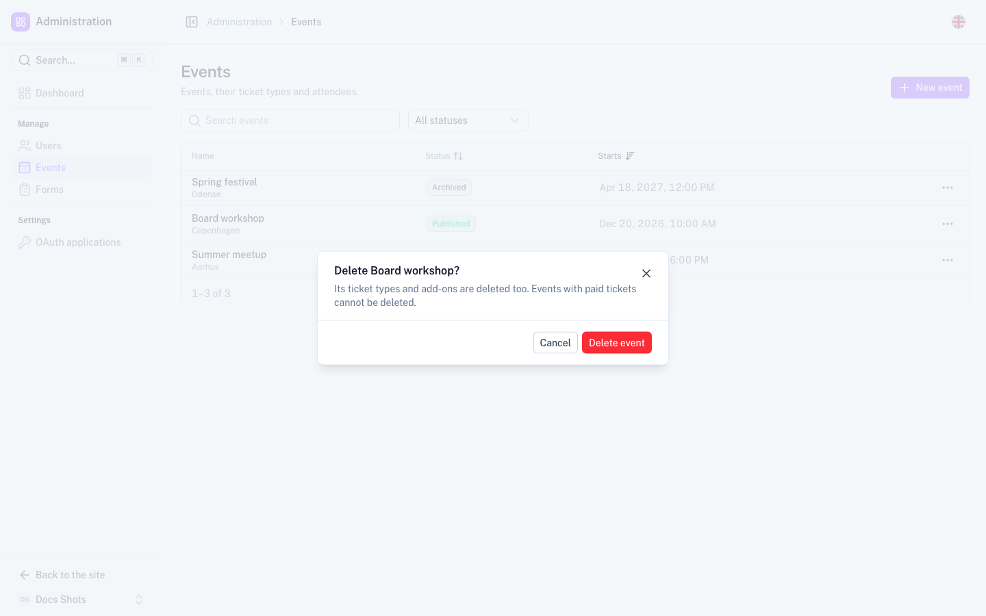
A destructive action asks for confirmation with useConfirmDialog({ destructive: true }), never with
window.confirm. The dialog says three things:
- The title asks about the record by name: "Delete Spring Gala?"
- The description says what else is affected: "Its tickets and attendees are deleted too."
- The confirm button names the verb and the object: "Delete event".
Feedback and errors
- Success. A successful action is a toast with a title. When useful, the record's name is the description.
- Failure. A failed action is a toast built with
errorToToast(e), oruseErrorToast()for a ready-made function. Both read the server's message from the usual places and fall back to a translated generic message. - Blocking problems. A problem that blocks the page, such as not found or forbidden, is a
UEmpty, not a toast.
useAction() wraps the common "busy, try, toast on error" block. Use it instead of writing that block again.Deep links instead of state hand-offs
A page that needs context from another page reads it from the URL, or opens the right form directly. Two examples:
- "Add ticket type" on an event opens the form with the event already selected.
- A ⌘K entry links to
?application=<id>.
Do not pass state through stores or history.state.
Next steps
- Text and formatting – word the buttons, toasts and dialogs on this page.
- UI composables – look up
useConfirmDialog,useActionanduseErrorToast. - Pages – place the row menu and the create button on a list or detail page.