Layouts and navigation
When every module draws its screens its own way, the app stops feeling like one product. The UX pattern pages fix that: each screen follows the same few patterns, whichever modules are installed. This page tells you which area a new screen belongs in, which layout it gets and where its navigation entry goes.
Read the four pattern pages before you add a screen, and follow them when you review one:
- Layouts and navigation (this page): the three areas and their navigation.
- Pages: lists, detail pages, overviews and the loading, empty and error states.
- Forms and actions: create and edit forms, row menus and confirmations.
- Text and formatting: strings, dates, links and a checklist for a new page.
The building blocks come from three modules. UI has the shared components. The Admin module draws the admin area. The Account module draws the account settings pages.
app.config.ts. The shared components add only structure and spacing.Pick the area
There are three areas, and each has its own layout. A page picks its area by its path. It never imports a layout.
| Area | Paths | Layout | What it is |
|---|---|---|---|
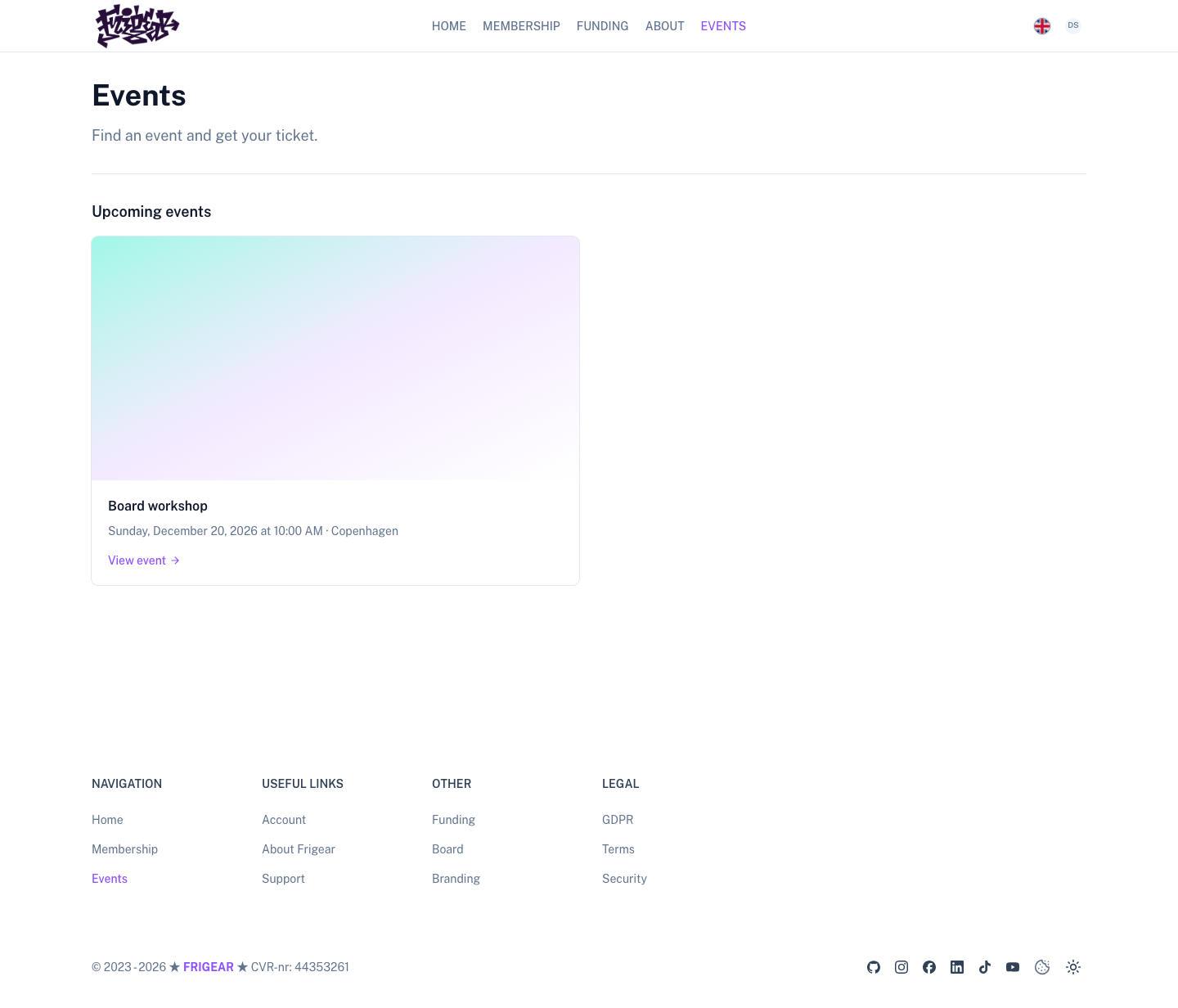
| Public site | Everything else | default, from the base layer | A header and a footer. Public pages use UContainer > UPage. |
| Admin area | /admin/** | admin, from Admin | A dashboard shell: a collapsible sidebar with grouped navigation, a ⌘K palette and the account menu in the sidebar footer. |
| Account area | /account/** | account, from Account | The site's header and footer around a centred settings grid, with a section list on the left. |
The admin layout is a thin layout around the shared shell (AppShell). Neither app area draws a heading. Every page in
the admin and account areas renders its own heading (PageHeading).
Admin area
The admin sidebar groups its navigation. Each group reads its own menu path:
| Group | Menu path | Put here |
|---|---|---|
| Overview | admin.nav.overview | The dashboard. |
| Manage | admin.nav (the root) | What staff manage every day: users, events, forms. |
| Settings | admin.nav.settings | Configuration: OAuth applications, integrations. |
The Overview group has no heading in the sidebar: its items, such as Dashboard, sit above the Manage and Settings headings. In the ⌘K palette the group is called "Go to".
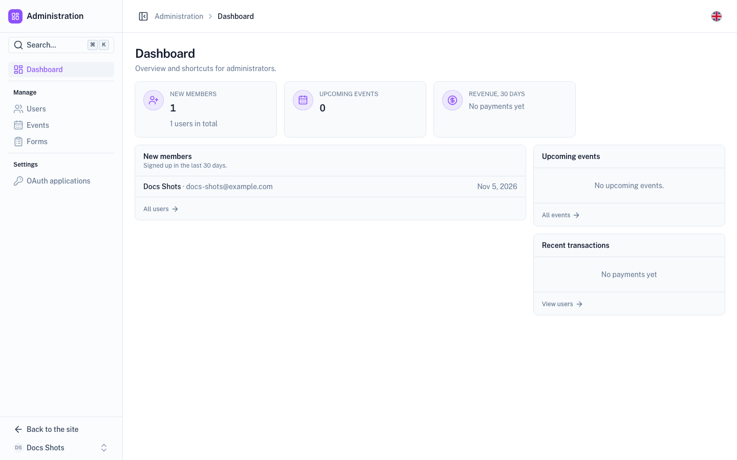
- Search. The ⌘K palette lists the same groups. So a page that is in the navigation is also searchable.
- Account menu. It sits in the sidebar footer as one button: your avatar and name, which opens a dropdown menu. When the sidebar is collapsed, the button shrinks to the avatar.
- Colour mode. It is not in the chrome. It lives in the account menu, under Appearance.
- Navbar. The navbar shows a muted "Area › Section" eyebrow, such as "Administration › Users". It is not a
title, so the page's own heading is the only
<h1>. - Width. The page body is centred at
max-w-7xlby default. A page that needs the full width, such as the form builder, setsdefinePageMeta({ wide: true }).
Account area
The account area is a settings page inside the site. Pages under /account/** render in the account layout.
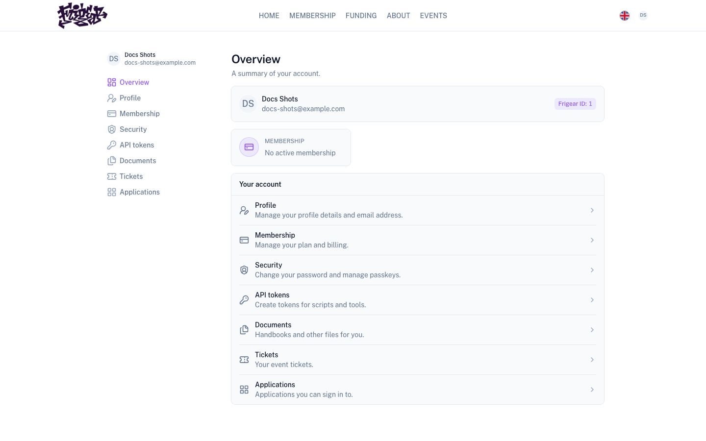
- Chrome. The site header and footer stay. The account menu (
AccountMenu) stays in the site header. - Grid. The content is a centred
max-w-5xlgrid. - Left column. A sticky column shows the signed-in user (a small
UUser). Below it is the vertical navigation, built from theaccountmenu. - Narrow screens. A section switcher (
PageSectionSwitcher) replaces the left column, above the content. - Identity. The signed-in user is shown once, in the left column. Headings do not repeat it.
The layout renders no heading, so every page renders its own as the first child of its root:
- Pages of the Account module use
AccountHeader, aPageHeadingfilled from the current menu item. - Pages that other modules add use
PageHeadingwith the menu item's own i18n keys. The label and the title then cannot drift apart.
/account itself is an overview. It shows a summary card (UUser plus AccountIdentity), the account.overviewwidget area and shortcuts to the other pages.
A module adds a page by registering the route and an item in the account menu. It never draws its own account
navigation.
Public site
Public pages, such as events, forms and content, are a different kind of page from app pages.
| Page | Container | Title |
|---|---|---|
| Public | UContainer > UPage, with UPageSection for bands | UPageHeader |
| App (admin and account areas) | A plain <div class="flex flex-col gap-4"> | PageHeading |
Do not mix them. The public header is a marketing-sized hero. PageHeading is a working title with actions.
Next steps
- Pages – build the list or detail page that goes in the area you picked.
- Add an admin page – add a page and its sidebar entry, step by step.
- Menu – look up menu paths and how modules add items to them.