UX patterns
Text and formatting
How a screen words its strings, formats dates and money and builds links, plus a checklist for a new page.
A screen reads as part of the app only when its words, dates and links behave like everyone else's. Modules ship their strings in Danish and English, and dates and money follow the visitor's locale. This page gives the rules for strings and values, and ends with a checklist that sums up all four UX pattern pages.
For: module authors and app developers who add or review a screen.
Text
- Translated strings. Every string goes through
useModuleT('<namespace>')with an English fallback. The module shipsdaandenJSON files. See Module Kit i18n. - Shared strings. Open, Edit, Delete and "Not set" come from the
patterns.*keys of UI, and an app can override them. - Button labels. Buttons and menu items name the object: "Add unit", "Delete application", "Revoke token". Never a bare "Add", "Delete" or "Save", unless the button sits in a section that is clearly about one thing.
- Dates and money. Format them with
useFormat(), so they follow the active locale. Do not calltoLocaleStringorIntldirectly. - Links. Build them with
useLocaleLink().localize, so a visitor on/da/...stays in their locale.
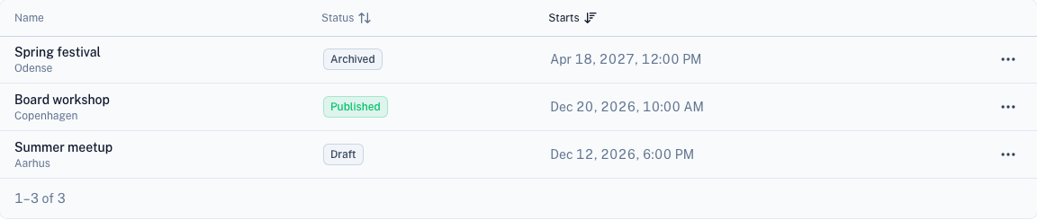
In a table, dates come from useFormat() and statuses are status badges (StatusBadge):
Checklist for a new page
- Pick the area: admin, account or public. Register the route, and add one item to the matching menu. See Layouts and navigation.
- Use the heading for the area. App pages use
PageHeading, and every app page renders its own: account pages throughAccountHeader. Public pages useUPageHeader. - Build lists from
TableCardandUTable, with aRowMenuand aUEmpty. Build detail pages fromSectionCards, with a breadcrumb. See Pages. - Send writes through a
use<Entity>Actions()composable and aFormSlideover. Destructive writes confirm. See Forms and actions. - Send strings through
useModuleT, withdaandenJSON. Buttons name the object. - Check the page in light and dark mode, at desktop width and at 375px.
What you should see: the new page looks like its neighbours in the same area, in both colour modes, at 375px and
at desktop width.
Where things live
| Need | Module |
|---|---|
Components, useConfirmDialog, useErrorToast, useFormat, statusColor, tableUi | UI |
| The admin shell, its navigation groups and the dashboard areas | Admin |
| The account layout, the account menu and the overview widgets | Account |
| Tabs and widget areas that other modules extend | Widget |
Navigation menus (admin.nav.*, account, main) | Menu |
Next steps
- Add an admin page – run through the checklist on a real page.
- UI – override the shared
patterns.*strings in your app. - UI composables – look up
useFormatanduseLocaleLink.