Pages
A staff member who has learned one list in the admin area should already know every other list. So pages in the admin and account areas are built from a few shapes. This page tells you which shape your page is, which shared components build it, and what it shows while it loads, when it is empty and when a request fails.
The components come from UI. Which area a page belongs in is on Layouts and navigation.
Which shape do I use?
| Your page shows | Shape | Section |
|---|---|---|
| Many records of one kind, such as users or events | A list page, with a detail page per record | Lists |
| One record with several sections | A detail page | Detail pages |
| A record with little of its own, such as a unit | A slideover over the list | Light entities |
| A few records that are not worth a table, such as passkeys | A divided list in a card | Divided list |
| Numbers and what needs a decision | An overview | Overview pages |
Every page has the same root: a plain <div class="flex flex-col gap-4">. There is no page wrapper component.
Lists
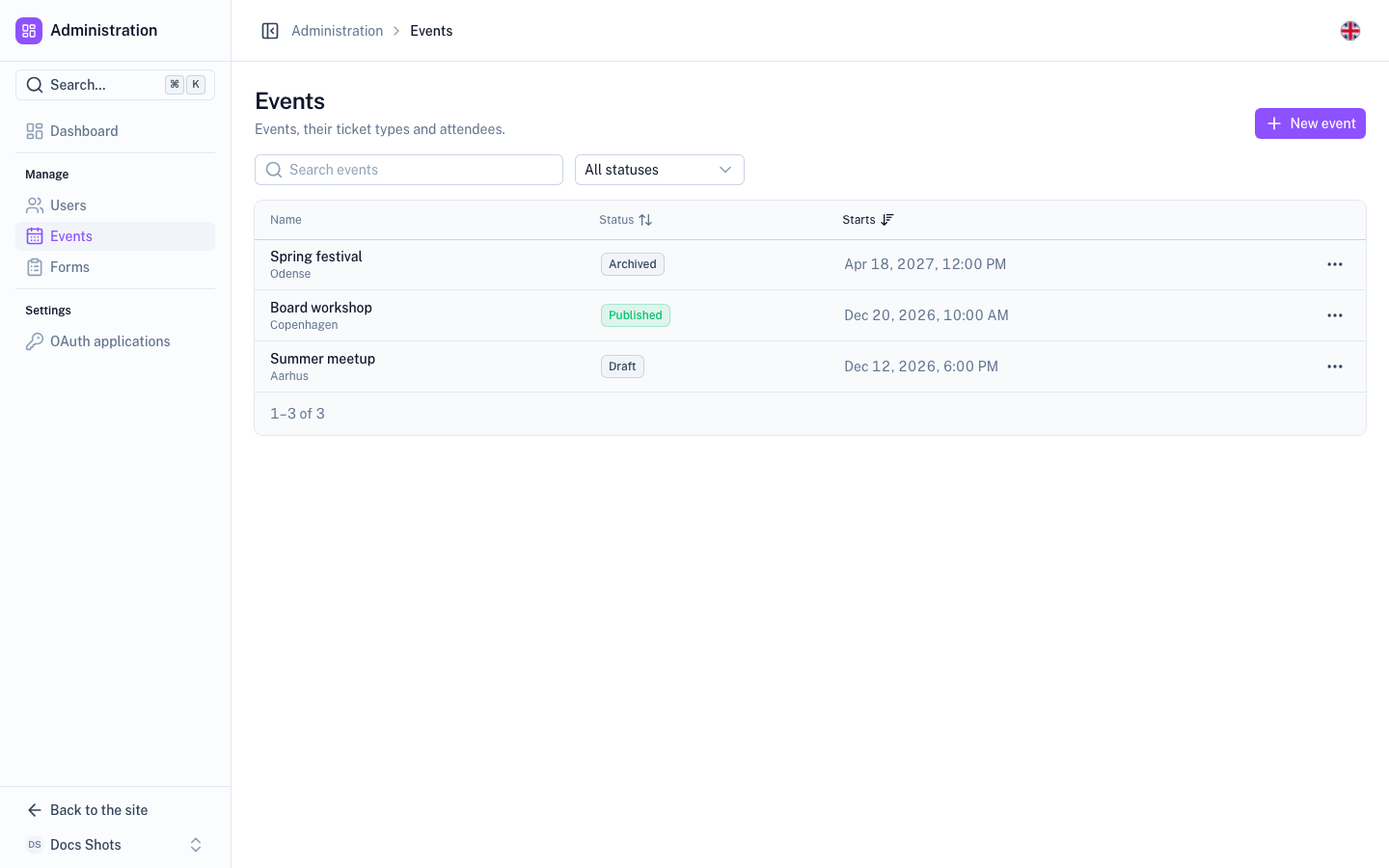
A top-level entity gets a list page and a detail page. The list page has, from top to bottom:
- A heading (
PageHeading) with the entity's name. The primary action, such as "Add user" or "New event", goes in its#actionsslot. - A toolbar (
PageToolbar) with search and filters, once the list is longer than about eight rows. Leave it out for short lists. - A table in a card. A
UTablesits insideTableCard, styled withtableUi(): small muted headers, compact rows on desktop and taller rows on mobile. Rows are clickable and open the detail page. - A row menu (
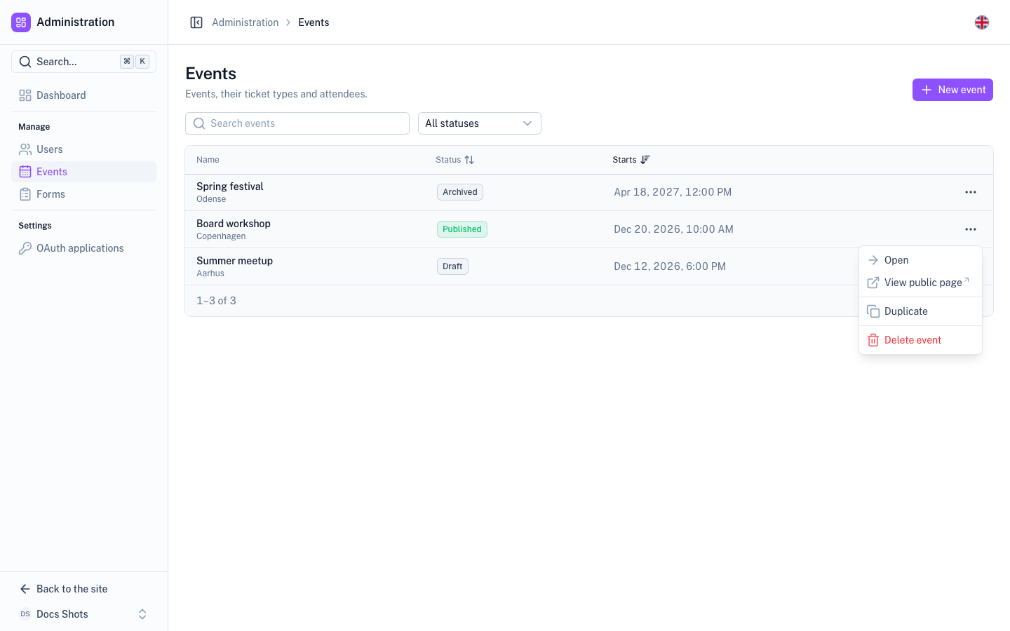
RowMenu) in the last column, for the row's actions. See Row actions. - Pagination (
TablePagination) in the card's#footer: "21–40 of 132", rows per page and pages. - An empty state (
UEmpty) when there are no rows, never an empty table. See Empty states.
The row menu opens with Open first and the destructive action last, in its own red group:
Tables share these behaviours:
- Sticky header. Long lists add
stickyandtableUi({}, { sticky: true }). The header then stays in view while the table scrolls inside its card. - Sorting. A sortable column uses
useTableSort().header(id, label): a ghost button that cycles ascending, descending and unsorted. - State in the URL. A server-paginated list keeps page, page size, search, sort and filters in the URL with
useTableQuery. So a filtered list can be linked, and it survives a reload.
TableCard :loading shows skeleton rows on the first load
only. Every later load, such as the next page, a new sort or a search, passes :refreshing. That keeps the current
rows and dims them until the new ones arrive. The empty state shows only after a load succeeded with no rows, never
while status is 'pending'. See Loading.Cells follow the same rules everywhere:
- First column. It is the record's identity (
TableIdentity): the name, a muted second line such as an email or a slug, and an optional avatar or icon. Badges that belong to the name go in its#badgesslot. - Numbers. They are right-aligned with tabular figures (
meta: numericColumn). - Dates. They use
useFormat()in atabular-numsspan. - Missing values. A missing value is a dimmed dash (
emptyCell()), never an empty cell. - Status. A status is a subtle badge whose colour follows the status. The component is
StatusBadge, and it picks the colour withstatusColor. To change the colour of one status, passcolors, for example:colors="{ archived: 'warning' }".
<script setup lang="ts">
import type { TableColumn } from '@nuxt/ui'

const t = useModuleT('events')
const format = useFormat()
const actions = useEventActions()

const { page, pageSize, search, sort: sortState, query } = useTableQuery({ sort: { id: 'startsAt', desc: true } })
const { header } = useTableSort(null, sortState)
const { data, status } = await useFetch('/api/admin/events', { query, default: () => ({ items: [], total: 0 }) })
const pending = computed(() => status.value === 'pending')

const TableIdentity = resolveComponent('TableIdentity')
const RowMenu = resolveComponent('RowMenu')
const columns: TableColumn<EventRow>[] = [
  {
    accessorKey: 'title',
    header: header('title', t('admin.title', 'Title')),
    cell: ({ row }) => h(TableIdentity, { title: row.original.title, description: row.original.location }),
  },
  { accessorKey: 'startsAt', header: header('startsAt', t('admin.starts', 'Starts')) },
  { accessorKey: 'capacity', header: t('admin.capacity', 'Capacity'), meta: numericColumn },
  { id: 'actions', cell: ({ row }) => h(RowMenu, { items: actions.menu(row.original), subject: row.original.title }) },
]
</script>

<template>
  <div class="flex flex-col gap-4">
    <PageHeading :title="t('admin.events', 'Events')">
      <template #actions>
        <UButton icon="i-lucide-plus" :label="t('admin.create', 'New event')" @click="actions.create()" />
      </template>
    </PageHeading>

    <PageToolbar>
      <UInput v-model="search" icon="i-lucide-search" :placeholder="t('admin.search', 'Search events')" />
    </PageToolbar>

    <TableCard :loading="pending && !data.items.length" :refreshing="pending && !!data.items.length">
      <UTable
        :data="data.items"
        :columns="columns"
        :ui="tableUi({}, { sticky: true })"
        sticky
        @select="(_, row) => navigateTo(`/admin/events/${row.original.id}`)"
      >
        <template #startsAt-cell="{ row }">
          <span class="tabular-nums">{{ format.dateTime(row.original.startsAt) }}</span>
        </template>
        <template #empty>
          <UEmpty variant="naked" icon="i-lucide-calendar" :title="t('admin.empty', 'No events yet')">
            <template #actions>
              <UButton :label="t('admin.create', 'New event')" @click="actions.create()" />
            </template>
          </UEmpty>
        </template>
      </UTable>
      <template #footer>
        <TablePagination v-model:page="page" v-model:page-size="pageSize" :total="data.total" />
      </template>
    </TableCard>
  </div>
</template>
A table in a tab or on a detail page sits in TableCard :title, with #actions for its primary action. That gives it
the same header as SectionCard. Never wrap a UTable in a flush SectionCard. Pass tableUi({ tr: '' }) when the
rows open nothing.
useTableSort()'s sorting with v-model:sorting, and
leave out useTableQuery and TablePagination.Detail pages
A detail page shows one record. It has:
- A heading (
PageHeading) with abreadcrumbback to the list, such as[Users, Ada Lovelace]. A status#badgegoes in it when the record has one. The primary actions go in#actions, with an outlineRowMenulast. - Sections. Each section is a
SectionCard. Key facts are aDescriptionList. - Save buttons per section. A form inside a section puts its Save button in the section's
#footer, astype="submit"withform="<id>". - Tabs. Sections that other modules can extend are
WidgetTabs. Sections the page owns arePageTabs. See Tabs. - A not-found state. A record that does not exist shows a
UEmptywith a link back to the list, never a blank page. See Failed, forbidden and not found.
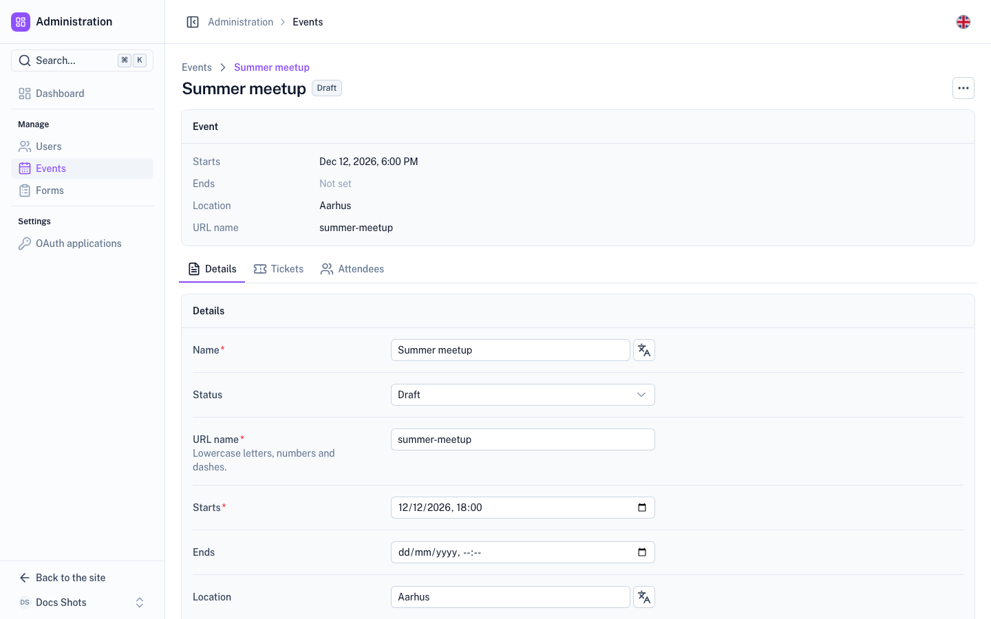
Inline settings forms use horizontal rows. Each field is a FormRow: a UFormField orientation="horizontal" with the
label and its description hint on the left and the control on the right. Below sm the two stack. The rows sit in a
parent with divide-y divide-default.
| Control | Width |
|---|---|
| Short control | class="w-full sm:max-w-sm" |
| Long text, such as a textarea or an editor | class="w-full" |
| Any control in the account area | class="w-full" |
In the account area the column is narrow. A capped input would stop short of the section's footer actions, and the right edge would go ragged. Slideover forms stay vertical.
<SectionCard :title="t('password.title', 'Password')">
  <UForm id="change-password" :schema="schema" :state="state" class="flex flex-col divide-y divide-default" @submit="save">
    <FormRow name="newPassword" :label="t('new', 'New password')" :description="t('newHint', 'At least 8 characters.')" required>
      <UInput v-model="state.newPassword" type="password" class="w-full sm:max-w-sm" />
    </FormRow>
  </UForm>
  <template #footer>
    <div class="flex justify-end">
      <UButton type="submit" form="change-password" :loading="busy" :label="t('save', 'Change password')" />
    </div>
  </template>
</SectionCard>
Tabs
Both tab components look the same: a bordered strip with an underline highlight. So a page never looks different because of how it is built.
| Use | When |
|---|---|
WidgetTabs | Other modules should be able to add sections to the page. An example is the user detail page, where Payments or Membership appear when those modules are installed. The active tab is in ?tab=. |
PageTabs | The page fixes its own sections, such as a form's builder, settings and access. Pass items with to for link tabs, where each tab is a route, or v-model for state tabs. |
WidgetTabs comes from the Widget module, and other modules add tabs with extendTabs.
Light entities
An entity with little of its own, such as a unit or an application, opens in a slideover instead of on a detail page.
The open record lives in the URL query, for example ?application=<id>. So ⌘K and other pages can link straight
to it.
Divided list
A short list of records that is not a table, such as passkeys, documents or applications, is a list inside a card:
- The card is a
SectionCard flusharound aul.divide-y.divide-default. - Each row is
li.flex.items-center.gap-3.px-4.py-3. - A row holds a leading icon or avatar, a
min-w-0 flex-1text block, and a trailing button orRowMenu. - The empty state goes inside the card, as
UEmpty variant="naked".
<SectionCard flush :title="t('documents.title', 'Documents')">
  <ul class="divide-y divide-default">
    <li v-for="doc in documents" :key="doc.id" class="flex items-center gap-3 px-4 py-3">
      <UIcon :name="doc.icon" class="size-5 shrink-0 text-muted" />
      <span class="min-w-0 flex-1 truncate font-medium text-highlighted">{{ doc.label }}</span>
      <UButton :to="doc.path" color="neutral" variant="outline" :label="t('documents.download', 'Download')" />
    </li>
  </ul>
</SectionCard>
Page-wide draft
Most pages save per section: the form sits in a SectionCard, and Save is in its #footer. One case is different: a
single draft that spans the whole page and that several cards edit, such as the form builder. Save then stays in the
heading's #actions, next to the status. The page still has one editor and one Save, never a Save per card.
Overview pages
An overview shows numbers first, then what needs a decision:
- Each number is a
StatCardthat links (to) to the list it summarises. - Then come
ListCards for what needs a decision, such as recent items or upcoming events.
The admin dashboard and the account overview are both built this way, from widget areas.
Empty states
An empty state says what the thing is and offers the single action that gets you going. An example is "No events yet" with a "New event" button.
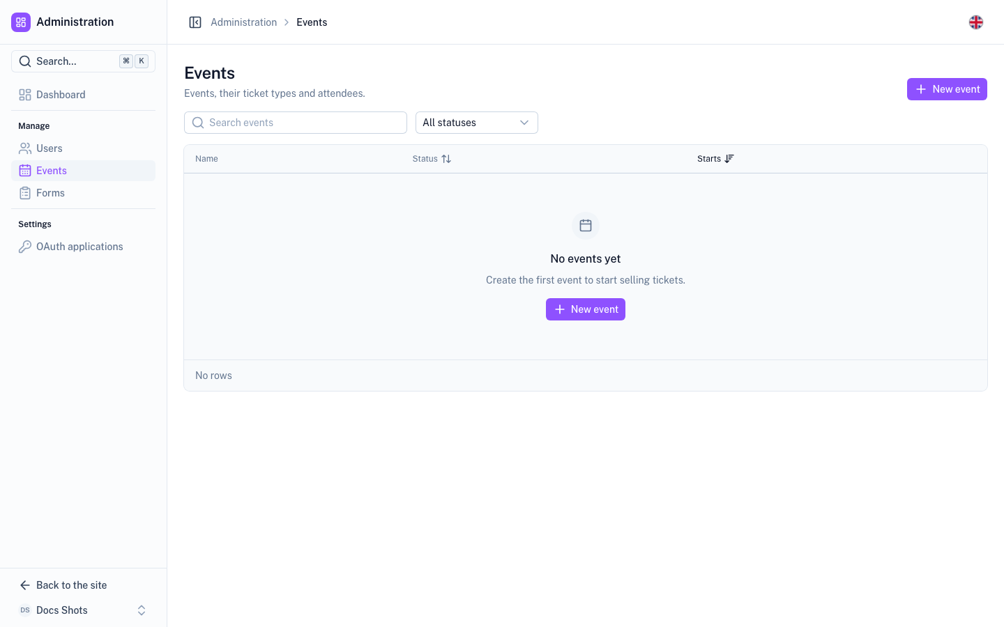
- It is a
UEmpty. There is no separate empty-state component. - Inside a card, use
variant="naked". - When a prerequisite is missing, point to it instead of the action, for example "Add a ticket type first".
Failed, forbidden and not found
A page whose data did not load shows a UEmpty as the page body. It sits inside the page root, below the heading when
the heading does not depend on the data. There are three cases. All use the default variant, because they replace the
body.
| Case | Icon | Title and description | Action |
|---|---|---|---|
| Failed (any other error) | i-lucide-circle-alert | "X could not be loaded", and errorMessage(error, fallback) | A neutral outline "Try again" (i-lucide-rotate-ccw) that refreshes |
| Forbidden (401, 403) | i-lucide-lock | "You are not allowed to see X" | None |
| Not found (404) | The entity's own icon, such as i-lucide-user-x | "X not found", and a hint such as "It may have been deleted." | A neutral outline "All X" that links to the list |
<UEmpty
  v-if="error && !data"
  :icon="forbidden ? 'i-lucide-lock' : 'i-lucide-circle-alert'"
  :title="forbidden ? t('admin.forbidden', 'You are not allowed to see events') : t('admin.loadFailed', 'Events could not be loaded')"
  :description="forbidden ? undefined : errorMessage(error, t('admin.loadFailedHint', 'Try again in a moment.'))"
  :actions="forbidden ? [] : [{ label: t('retry', 'Try again'), icon: 'i-lucide-rotate-ccw', color: 'neutral', variant: 'outline', onClick: () => refresh() }]"
/>
error && !data, not error alone. Otherwise a failed background refresh replaces rows that are already on
screen.Loading
A page never says "nothing here" before it knows. An empty state, a "join" hero or a "not a member" message is a claim about the data. So it renders only after a load succeeded and found nothing.
- Pages await their data. Await the fetch that loads the page's main data. That fetch is
useFetch,useCachedFetchor a module composable that can be awaited, such asuseMyTickets(). The server then renders the page with its data, and hydration shows the same thing. Never leave the main data un-awaited with a default such asdefault: () => []. - Data that should survive navigation uses
useCachedFetch. See UI. PlainuseFetchdata is dropped when the page unmounts. Going back then flashes the empty state while it refetches. - Widgets may load lazily. Only widgets, and secondary parts of a page that must not hold up the render, load
without waiting. They use
useLazyFetchor an un-awaited fetch. While they load, they show a skeleton: each card component takes aloadingprop for it (SectionCard,ListCard,TableCardandStatCard). - Skeletons keep the size. A skeleton has the size of what it replaces, so the layout does not jump when the data arrives.
status === 'pending' && !data, or useCachedFetch's loading. Gating on
status === 'pending' alone replaces the current content during a background refresh.error and show a UEmpty with the
message, or a toast for a background refresh. Otherwise "you have no tickets" shows because a request failed.Next steps
- Forms and actions – add the create form and row menu this page's lists use.
- Add an admin page – build a list page with a sidebar entry, step by step.
- Page components – look up the props of each component named here.